The Most Inaccurate Signs in Las Vegas History
Posted on: March 31, 2026, 07:21h.
Last updated on: March 29, 2026, 04:22h.
- The historical accuracy of vintage Las Vegas signage took a backseat to other considerations
- These included glamour, visual impact, and structural stability
- In three of the four examples below, the animals depicted do not even match the animals in the business name
Las Vegas has never cared whether a sign matches the name on the building. The city’s visual language was built on glamour, legibility, and emotional impact, not accuracy. Here are the biggest mismatches so familiar, people never questioned them. (Did we miss any? Put them in the comments!)
The Silver Slipper
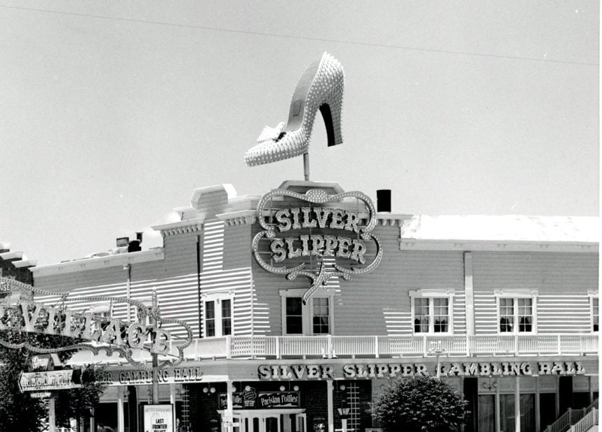
The Silver Slipper’s marquee was a towering, twirling, glittering pile of wrong. No slipper in the history of footwear — regardless of color — has ever featured an arched instep, pointed toe, and stiletto heel. And “slippers” was never slang for high heels.
The mismatch was the brainchild of Jack Larsen Sr., a former Disney animator who later worked for YESCO (Young Electric Sign Company), the powerhouse behind many of Las Vegas’ most iconic neon signs. According to YESCO, Larsen based the design on one of his wife’s pumps because it projected glamour, nightlife, and showgirl fantasy — all of which matched the direction the property was taking as it leaned into burlesque‑style entertainment.
In addition, a soft and flat-soled indoor shoe would have disappeared against the visual noise of the Strip, but a stiletto offered a bold silhouette and instant recognizability when lit by hundreds of bulbs and set spinning above Las Vegas Boulevard.
The 12-by-17-foot “slipper” was restored in 2009 and can be seen today on Las Vegas Boulevard North near the Neon Museum. (A second version on Fremont Street East is a “tribute” slipper.)
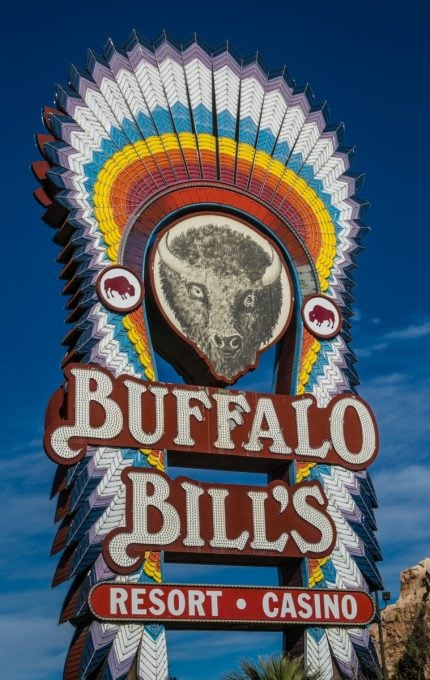
Buffalo Bill’s
The marquee for Buffalo Bill’s in nearby Primm, Nev. clearly depicts a bison, not a buffalo. This native-to-America species has massive shoulder humps, dense beards, and short horns that curve upward.
Buffalo — which have long, sweeping horns and no humps or beards — never lived in North America. They’re from Africa and Asia. But when early European settlers saw the massive, shaggy beasts, they declared: “Buffalo!” and that was that.
The mistake not only stuck, it became entrenched in Americana. (See Bing Crosby’s 1933 hit, “Home on the Range.”) So the sign for Buffalo Bill’s ran with the mistake rather than challenging it.
The Golden Steer
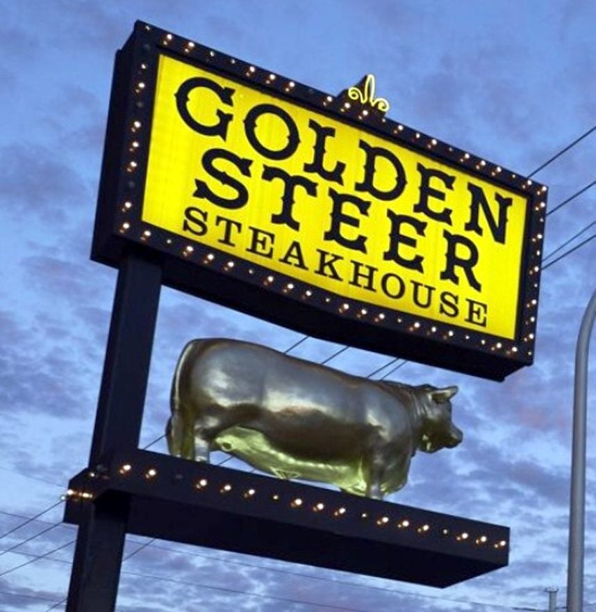
A steer is male bovine that’s been castrated. Sending the animal to the choirboy program prevents the growth of the full horns and musculature on prominent display in the Golden Steer’s fiberglass model out front.
And that’s bull.
But steakhouse signs sell steak, not accuracy. And a hornless steer does project the same masculine cowboy aesthetic as a bull ready to charge.
Besides, a bull is appropriate for a restaurant that claims to have opened in 1958 and served many Las Vegas celebrities that never ate there. (We busted those myths here.)
The Golden Goose
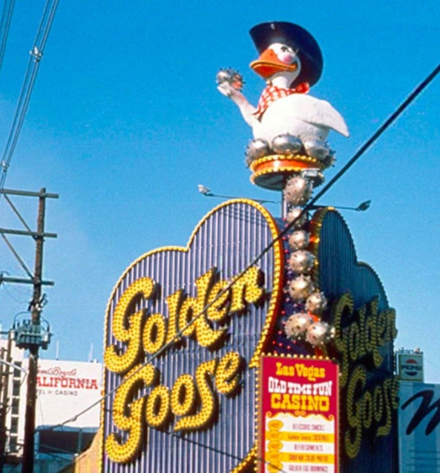
We might be stretching the limits of iconographic inaccuracy by including a cartoon sign on this list.
But just look at this sign and tell us it isn’t a golden duck.
From its short neck, wide bill, and round body, every trait is duck‑correct and goose‑impossible.
The question is why Herb Pastor, the owner of this Fremont Street casino — which he opened on the former site of the Mecca Casino in 1975 and closed in 1980 — didn’t attempt a goose silhouette.
A likely reason is structural convenience: ducks are compact and stable; geese have long necks that could pose problems for a rotating figure for a windy rooftop.
Ducks are also way cuter.
So the name said goose, the mascot said duck, and no one ever seemed to notice or care.
The restored golden duck can be seen today at the corner of Fremont Street and 10th Street downtown.
No comments yet