
Station Casinos Revamps Logo for 50th Birthday, Opinions Abound

If you’re one of those birthday people, Station Casinos is a card-carrying member of your tribe. The company has been downright giddy about turning 50, and as with any proper midlife crisis, Station Casinos is (or possibly “are”) going through some changes.
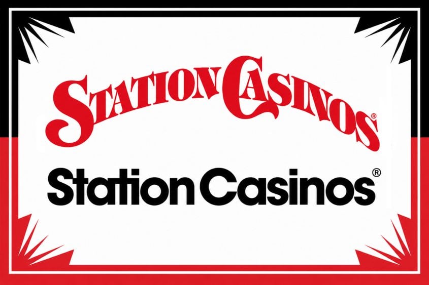
Mixed in with its recent celebratory hoopla, Station Casinos quietly revamped its longtime logo.
We can’t let this momentous occasion pass without some analysis and mansplaining, of course. Let’s look at how the new Station Casinos logo wins and fails by calling upon some of the world’s most renowned branding and graphic design experts for input, and by that we mean we asked ChatGPT and Grok to give us their take. Don’t roll your eyes, they’re really good at this.
If the name Station Casinos doesn’t ring a bell, you’re a tourist. Station Casinos casinos mainly serves (or possibly “serve”) locals. We trust this will not deter you from enjoying our deep dive into their logo redesign as it will greatly enrich your life immeasurably, probably.
Station Casinos locations include Red Rock, Durango, Green Valley Ranch, Palace Station, Sunset Station, Boulder Station and Santa Fe Station. We personally pay to keep the lights on at Red Rock, about 15 minutes west of The Strip. (Locals casinos are all about geography.)
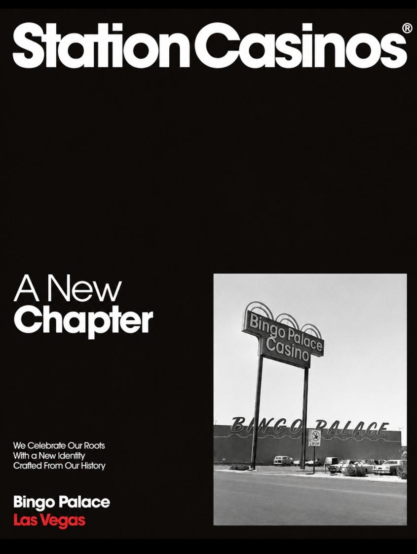
The 50th birthday of Station Casinos coincides with the opening of the company’s first casino, The Casino. The Casino opened July 1, 1976. The Casino later became Bingo Palace. Bingo Palace was rebranded Palace Station in 1984.
But enough with the housekeeping, we have some serious logo design opinions to mull upon (or possibly “over”).
The consensus among the “experts” we consulted is this: “The logo refresh is better as a corporate identity system, but it is also less distinctive as a casino brand.”
Basically, the old logo had personality. The new logo has discipline.
The old logo says old Vegas, approachable, kitschy, recognizable. The new logo says modern hospitality company, scalable, clean, less weird.
We love A.I. ChatGPT and Grok tell it like it is. They aren’t sentimental, they aren’t swayed by the history of Station Casinos. They aren’t resistant to change, nor is their critique influenced by things like the doofy political leanings of a company’s leadership.
A.I. is objective and honest and fair. With that in mind, here are both some positives and negatives about the new Station Casinos logo.
A new logo, inspired and crafted from our past, and rooted in 50 years of Vegas history. pic.twitter.com/3ZeX4SclzG
— Station Casinos (@stationcasinos) July 1, 2026
The Strengths
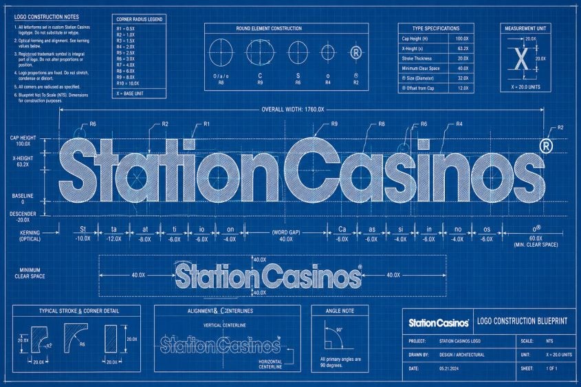
ChatGPT provided this overview of the redesign: “The new mark is dramatically more usable. The old logo was a typographic stunt: arched baseline, uneven letter stress, western/circus/Vegas-adjacent ornamentation and a giant theatrical ‘S’ and ‘C.’ It worked as a sign or legacy brand badge, but it was clunky in digital spaces.”
When we see a logo, we sometimes forget logos serve practical purposes. Logos have to work in formats that literally didn’t exist when many were originally designed.
ChatGPT adds: “The new logo is cleaner, more legible and much easier to use across apps, social media, hotel collateral, ads, uniforms, signage, loyalty club materials and tiny mobile placements. It also feels more aligned with newer Station properties like Durango, where the design language is less ‘locals joint’ and more ‘lifestyle resort.’ The new one also fixes the hierarchy. In the old logo, the words had drama but not much sophistication. The arched treatment made the logo feel like a banner over a county fair entrance. The new logo reads instantly and confidently.”
We don’t really understand how A.I. knows all this, but we can’t disagree with anything it’s saying about the new logo.
Grok was champing at the bit to get in on this, so we asked for its pluses/minuses list.
Strengths included “Outstanding Simplicity & Legibility,” “Strong Typographic Craft,” “Maximum Versatility,” “Professional & Trustworthy Tone” and “Strategic Alignment with Heritage Rebrand.”
If you are a logo and design nerd, you might enjoy seeing the detailed elements of this list. If you are not a logo and design nerd, you might be nodding off into your soup. We get it.
Also, why are you eating soup? It’s 180 degrees in Las Vegas right now. Soup heats itself.
Anyway, here are Grok’s thoughts about each of the strengths.
Outstanding Simplicity & Legibility: “This is a textbook example of minimalist wordmark design done right. The bold, geometric sans-serif typeface delivers instant readability at any size, from highway billboards and building fascias to app icons and social thumbnails. There are no decorative elements, gradients, or fine details that could break down or feel dated.”
Wild coincidence. Our band in high school was called The Building Fascias.
Strong Typographic Craft: “The letterforms feel confident and well-balanced. The weight is substantial without being heavy-handed, and the spacing (kerning) between letters appears precise and harmonious. ‘Station’ and ‘Casinos’ lock together as a single, unified brand statement rather than two separate words fighting for attention.”
When we first saw the logo, we felt the kerning was too tight. Or as they say in the business, “airless.” That “ati” in “Station” will haunt our nightmares. Maybe A.I. gets to that in the “Weaknesses” section. The suspense is terrible.
Maximum Versatility: “Pure monochrome execution is a strategic strength. It reverses cleanly, works in single-color applications (signage, embroidery, foil stamping), and performs equally well in light or dark environments. This reduces production costs and maintains brand consistency across every touchpoint.”
Station Casinos is known for its use of embroidery!
Professional & Trustworthy Tone: “In the gaming industry, where customers entrust money and expect reliability, this logo projects stability and corporate maturity rather than flashy spectacle. For a ‘locals’ casino operator, that restraint feels authentic and reassuring.”
The previous logo wasn’t exactly “flashy,” but it had character. Maybe too much. Grok is right that casinos have to be trustworthy, like banks. A whimsical logo doesn’t convey trust, it conveys playfulness and fun. The new logo isn’t fun, but not all the heavy lifting has to be done with a logo. Social media can do that part.
Strategic Alignment with Heritage Rebrand: “The refreshed wordmark successfully captures the ‘simplicity of the time’ from the 1970s Bingo Palace era while feeling current. It pairs conceptually with the reimagined arch symbol (drawn from the original roadside sign) that completes the broader identity system.”
Station is definitely trying to connect its past and its future. A post on Instagram said, “Inspired by decades of history, from vintage playing cards and casino chips to our original signage, our new identity honors where we’ve been while embracing the future. The reimagined arch from the original Bingo Palace sign stands as a symbol of continuity, connecting our roots to the next chapter of the Station Casinos story.”
It’s a bit of a reach, but you get the idea.
That’s a lot of positive feedback about the new Station Casinos logo.
Credit where it’s due: The new logo was developed by branding and design studio The New Company and the Station Casinos in-house marketing team.
Read more about the rebrand in the Station Casinos blog. Stations is one of the few casino companies smart enough to realize how powerful blogs are. Most are 10 years behind the curve when it comes to content marketing. Don’t get us started.
If you work at Station Casinos, you can stop reading here. We’re going to get into the weaknesses of the new logo. You already pulled the trigger on it, so there’s no going back, unless you want to ask The New Company to give that “ati” some additional breathing room. Otherwise, great job! Just print the first part of this story for your corporate overlords.
The Weaknesses
ChatGPT had some strong opinions about the logo’s weaknesses: “The biggest weakness is that it is generic. The old logo could only be Station Casinos. The new logo could be a fintech app, a sportsbook, a streaming service, a restaurant group, a credit union or a casino company. It is professionally bland.”
Yep, agree. They moved from character to competence. As we said, a logo can’t do everything. Practicality wins this time.
Further, ChatGPT says, “The other issue is that the new mark loses almost all sense of place. Station Casinos is a Las Vegas locals institution. The old logo, for better or worse, had Nevada casino DNA. The new one has very little Las Vegas in it. It is clean enough to be national, but Station is not really a national brand in the way Caesars, MGM or Hard Rock are. So the modernization creates a mild identity mismatch: the company looks bigger and more neutral than its actual brand footprint.”
The previous logo wasn’t specific to Las Vegas, but the old-timey font was definitely giving some western saloon vibes. It felt accessible and unpretentious. Most importantly, the old logo was pre-corporate. You know, corporations, the things people say are ruining Las Vegas.
A final thought from ChatGPT: “The rounded type feels a little safe. There is no memorable custom gesture, no clever ligature, no icon, no distinctive ‘ownable’ shape. The most distinctive thing is the weight of the font, and that is not enough to make it proprietary.”
“Generic” is a pretty good word for it.
Grok got into it again, too.
Limited Stand-Alone Distinctiveness: “As a pure text logo, it lacks a unique visual hook. In a crowded Las Vegas market full of iconic symbols (lions, laurels), this wordmark on its own could feel somewhat generic or interchangeable with corporate brands outside gaming.”
Sensing a theme?
Emotionally Neutral: “Casinos thrive on excitement, luck and entertainment energy. This logo is deliberately corporate and understated. It doesn’t inherently communicate fun, luck or local Vegas pride.”
It’s worth noting the logo will often be used in conjunction with symbols (the Poker Palace arch). It will also presumably be used with a new slogan, “From Vegas. For Vegas. Always Vegas.” That takes some of the pressure off the logo as a stand-alone.
Color Personality Is Underdeveloped: “The black-and-white presentation is versatile but safe. Many successful casino and hospitality brands own a signature color that becomes instantly ownable (think specific reds, golds or deep blues). Without a strong primary brand color locked into the wordmark system, recognition may rely more heavily on consistent usage and the supporting arch symbol.”
Think Tiffany blue or Barbie pink or Coke’s red and white. UPS? Brown and gold. Home Depot? Orange. FedEx? Purple and orange. The new Station logo can be done in any color, but that also means it doesn’t own any colors.
Slight Risk of “Corporate Blandness”: “The modern sans-serif treatment is handsome and timeless, but it is not highly customized. In an industry where bespoke letterforms or subtle ligatures can create strong trademark protection and memorability, this feels like a very well-chosen existing typeface rather than a truly proprietary one.”
Bland is the new generic.
So, do you agree or disagree with A.I.’s assessment of the Station logo do-over?
Did A.I. miss anything?
A.I. didn’t mention the claustrophobic kerning, proof A.I. is still in its early stages of development, all due respect.
A.I. has a lot of information at its virtual fingertips (it has vast access to writing about branding, typography, advertising, visual communication, marketing strategy and graphic design criticism), but ultimately design is subjective.
We love A.I. because it can often articulate something we’re thinking but don’t possess the vocabulary to express.
We love that A.I. can be a casino surveillance expert one moment and a branding authority or graphic designer the next. We also love that A.I. can read casino quarterly earnings reports and summarize them so we don’t have to.
A.I. is far from perfect. For example, it can’t get the pips right on dice to save its life. We’ll let A.I. explain: “Because generative A.I. models are optimized to synthesize statistically plausible visual patterns, not to enforce discrete symbolic constraints, they often render ‘dice-like objects’ with locally convincing pip clusters but fail the combinatorial rules of real dice: exact pip counts, opposing-face sums, rotational consistency, perspective-aware dot placement and the invariant topology of a six-sided cube.”

It also isn’t great at jokes, or we’d be out of a gig.
But when it comes to evaluating logos, A.I. is king! Well, here’s what it said about the new Station Casinos logo: “The old logo was dated but memorable. The new logo is modern but forgettable.”
Which is exactly what we’d have said if we knew everything about everything all at once.


Leave your thoughts on “Station Casinos Revamps Logo for 50th Birthday, Opinions Abound”
12 Comments