ChatGPT Tears Green Valley Ranch a New One Over New Logo
Green Valley Ranch casino, owned by Station Casinos, recently unveiled a new logo.
Logo refreshes are often described as “lame” or “pointless,” unless there’s a kerfuffle like the one associated with Cracker Barrel. The company took a big hit for removing the old guy from its logo, and the logo has since reverted back to the original.
We are a noted kerfuffle expert, so we are forced to share that ChatGPT really, really hates Green Valley Ranch’s new logo. Slow news days are made for crap like this, so let’s take a deep dive into why the new logo is a fail, all due respect to the Russian kid on Fiverr who designed it.
Most Las Vegas tourists have never visited Green Valley Ranch, but it is a popular spot with locals.
Green Valley Ranch checks a lot of boxes for a locals casino, but Station apparently felt the “visual identity” of the casino needed some zhuzhing.
On a related note, how “zhuzh” is pronounced “jooj,” we may never know.
Anyway, our snarky Fiverr comment aside, it’s obvious Station Casinos gave a lot of thought to the new Green Valley Ranch logo. We know this because it says so in a blog post on the Station Casinos Web site.
The blog post puts everything into context: “Green Valley Ranch, Henderson’s beloved locals’ destination, has unveiled its new logo, marking the next chapter in the resort’s story as it continues its $200 million property-wide renovation and approaches its 25th anniversary in December 2026. The refreshed identity also introduces a new monogram—a modern shorthand that subtly blends the G-V-R into an elegant shorthand—reflecting the property’s evolution while honoring its legacy.”
Point one: A.I. uses a lot of em dashes. Just saying.
Point two: We absolutely hate when casinos and hotels and resorts refer to themselves as properties, mostly because they’re the only ones who do. Normal people call them casinos and hotels and resorts. “Property” is an internal term that should stay that way.
Point three: Henderson is basically a suburb of Las Vegas, just with a much smaller percentage of African-Americans than the national average which isn’t awkward as long as nobody points it out.
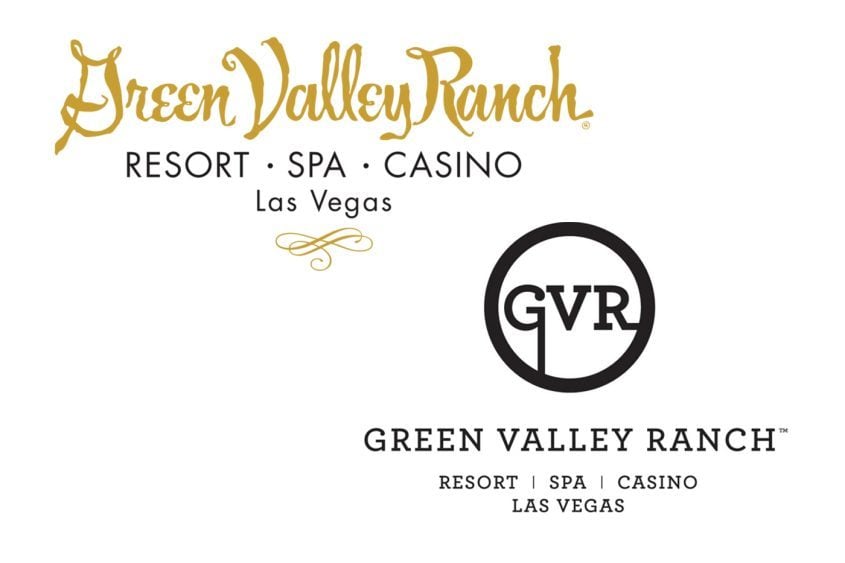
As far as the logo goes, here’s what the blog post says: “The new visual identity is designed to reflect both the transformation of the property and the guest experience. Introducing custom typography and a refined design language, the new logo mirrors the resort’s upcoming light, airy and contemporary aesthetic, with a renewed sense of approachable sophistication. Just as the newly designed rooms and suites are set to debut later this year, the complementing logo signals Green Valley Ranch’s evolution while honoring its enduring legacy as a premier off-Strip destination appealing to locals and visitors alike. Together, the wordmark, monogram, color palette and typography embody Green Valley Ranch’s balance of classic sophistication and contemporary warmth.”
As the kids say, “ChatGPT has a bone to pick with Green Valley Ranch.”
See, ChatGPT has basically learned everything there is to learn about branding and graphic design and typography and “wordmarks.” It has learned it by consuming all the information about these subjects available, ever.
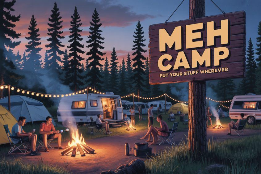
Our initial reaction to the new GVR logo was: “Meh.”
That’s because we are not A.I. If we were, we would be generating images of Holly Madison in bikinis all day. We simply do not have the expertise or facility with language to give a more articulate and specific version of “meh.”
ChatGPT, however, is all over it.
Here, then, are some thoughts from ChatGPT about why the new Green Valley Ranch logo gets a grade of C, or in the jargon of the street, it sort of sucks.
Here’s what ChatGPT says are the problems with the new logo.
1) Poor typography balance
Stroke contrast and serif shapes don’t match across words: the G/R/N have softer wedges while V/A/L have sharp, gothic chisels. The typography is stretched and contorted, especially the V and R. The V extends below the baseline and disrupts the rhythm of the letter spacing. The R has an exaggerated leg that pulls the viewer’s eye downward. This makes the logo feel unstable, almost like it’s “sagging” in the middle instead of exuding strength and refinement. The mix of varying stroke weights (thick to ultra-thin) feels inconsistent and amateurish, rather than deliberate or sophisticated.
2) Brand-tone mismatch
Green Valley Ranch markets itself as an upscale resort with Mediterranean architecture and a spa-like, elegant vibe. This logo, however, has a gothic/fantasy aesthetic, more like a title treatment for “Game of Thrones” or “The Witcher.” The long serifs and angled stems evoke “fantasy epic,” not “luxury resort.” It lacks warmth or hospitality; it feels cold and theatrical. GVR’s promise is warm luxury (spa, pool, dining, neighborhood resort). The tone clashes with “relaxation and resort” and skews toward “showroom/metal band.”
3) Weak hierarchy
“Valley” gets all the drama; “Ranch” collapses into it. “Green” is heavy on the left, then your eye slams into the monolithic V, then skates past “Leyranch” as one unit. Guests should parse Green/Valley/ Ranch instantly. The descriptor line (“casino, resort, spa”) floats and is too tight letter-spaced for its size, reducing legibility at small scales.
4) Negative-space and flow problems
The V’s left stroke pinches tight against E/N, creating dark spots; the right stroke crashes into A/L, making an awkward valley of negative space.
RN in “Ranch” nearly reads as M at distance (classic RN crowding problem). Result: Your eye doesn’t glide across the logo; it trips over it.
5) Kerning and spacing
Needs pair fixes: GR (+10–15), EE (+20–30), EN (+10), VA (−40), AL (−20), LE (+10), EY (−15), YR (+15), RA (+20), RN (+25), NC (+10). Tracking across “Ranch” should open 5–10 units to stop the RN=”M” illusion. The bullets in the tagline are tight to letters; add ~1/3 em on both sides.
6) Versatility and reproduction
The thin hairlines and spiky serifs risk filling in on small embroidery, glass etching and back-lit signage. The tall V creates an extreme horizontal lock-up that won’t square off well for avatars/app icons. Inverse (black on light stone) will lose delicacy; the mark lacks a robust single-color and a stacked variant.
7) Loss of brand heritage
Prior GVR equities (Tuscan/Oleander garden vibe, warm desert palette, approachable luxury) aren’t referenced. This feels like a new brand more than a modernized GVR.
We actually understood some of those words!
Announcement: It's a new day at GVR in Henderson.
We’re thrilled to introduce an elegant new brand, logo, and aesthetic that complements our property-wide transformation.
Today, we unveil our new logo, setting the tone for an exciting new chapter of hospitality at our iconic… pic.twitter.com/Bbw4RpqJ8O
— Green Valley Ranch (@GVRcasino) October 21, 2025
ChatGPT is nothing if not helpful, so it provided some recommendations to Station Casinos, who were definitely looking for feedback about something they’ve already rolled out.
1) Legibility first
Reduce the V height ~15–20%, keep it distinctive but not dividing. Insert a subtle hairline gap or micro-divider between “Valley” and “Ranch,” or slightly increase tracking in “Ranch” to prevent run-on.
2) Harmonize the serif
Choose a single high-contrast serif family with multiple optical sizes (e.g., Rebond Didone, Canela/Canela Deck, Romaine or a custom cut). Match terminals so G/R/N don’t feel from a different set than V/A/L.
Personal aside: You will never guess the name of our band in high school.
3) Re-kern completely
Apply the pair adjustments above; then open global tracking +10–15 in “Ranch.” Test at 12–18 ft viewing distance.
4) Hierarchy
Weight “Green” and “Ranch” a touch heavier (or slightly wider) to balance the drama in “Valley.” Consider small caps for “Green” and “Ranch” with a normal-case “Valley” to aid word recognition.
5) Tagline treatment
Increase size 10–12%, set in a humanist sans small caps (e.g., Freight Sans, Optimo Px Grotesk SC) for contrast; add bullet spacing and raise baseline slightly. Ensure it locks to full word-mark width, not just “Valley.”
6) System and variants
Build three lock-ups: Add a solid-weight version for embroidery/etched glass. Define a warm palette (e.g., deep pine, sage, bronze) to re-introduce “Green” and resort warmth; the stark black-white can remain for premium uses.
7) Tame the “blade”
Keep the V’s identity but soften terminals and widen the inner counter so it stops reading as a separator.
Here’s ChatGPT’s scorecard. Distinctiveness: B (the V is memorable); Readability: C−; Brand fit (resort warmth): C; Repro versatility: C; Typographic craft: C−.
Bottom line: There’s a strong idea, but the current execution hurts legibility, skews the tone darker than the brand, and won’t scale well. A disciplined typographic pass (kerning/optical sizing), toned-down centerpiece, and tighter system (stacked/mono variants, improved tagline) would rescue the equity while aligning with Green Valley Ranch’s premium-but-welcoming personality.
That is almost exactly what we meant by “meh.”
Far be it from ChatGPT to just critique without a viable alternative featuring all the fixes it suggests.
One of the great things about A.I. is you can ask for an infinite number of drafts. It doesn’t get tired. It just keeps working. Basically, for free. Graphic designers demand things like “breaks” and “places to sit” and “health coverage” and “sunlight.”
We asked ChatGPT to provide additional versions of the Green Valley Ranch logo.
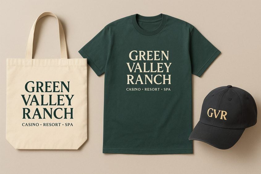
We didn’t stop there, of course. A resort logo has to be flexible, and by that we mean available on merchandise.
ChatGPT has got this. It took two minutes to generate these mock-ups that would’ve taken weeks and months of meetings in the real world. We hated meetings when we had real jobs. In pretty much every company we worked for, our yearly performance review included the line, “You roll your eyes in every meeting. A lot.” That’s because meetings are useless wastes of time and eye-rolling is the only reasonable way to address this fact.
Anyway, here’s some merch!
Are we completely happy with ChatGPT’s rejiggered Green Valley Ranch logo? No, of course not. Why?
We hope this foray into logo design and branding has been as interesting to you as we are to us.
Don’t even get us started about motion identity, experience design and brand materiality. By that, of course, we mean don’t get us started because we have no idea what those things are.
Could we have just ignored this logo unveiling like everyone else? Of course.
But blogs require words. These were several of those.
We were going to ask logo designers, creative directors or marketing strategists to contribute to this discussion, but realized you do not actually care about their opinions. If you did, they would probably have blogs.
What do you think about the new Green Valley Ranch logo?
Are you in the “meh” camp?
Before we go, we know what you’re thinking. Who are you, Vital Vegas, to judge the logo of someone else?
Who made you like this?
Also, here’s ChatGPT’s assessment of our logo.
Conclusion: ChatGPT is really good at ass-kissing.
Green Valley Ranch’s new logo was designed by an agency, The New Company. Jules Tardy, Partner & Creative Director of The New Company, said “In reimagining the Green Valley Ranch identity, we explored a modern twist on classic typography that feels both timeless and unexpected. Through reductive minimalism and refined detailing, the logo conveys a sense of understated luxury that aligns with the property’s renewal while setting the stage for its next chapter.”
This, friends, is how creatives make themselves seem essential to clients in a time when A.I. is going to make their jobs moot. Or as it’s known in the parlance of the industry, gobbledygook.
What does ChatGPT think of the exec’s smoke-blowing?
ChatGPT doesn’t mince words: “The design statement oversells what’s essentially a safe, handsome wordmark. The Green Valley Ranch logo isn’t a ‘modern twist’ so much as a modest polish on classic resort typography. It feels timeless because it barely takes a risk. There’s no ‘reductive minimalism’ here, just tidy letterspacing and an elongated V that nods to elegance without redefining it. The talk of ‘refined detailing’ and ‘understated luxury’ is fair enough—the black-and-white restraint does feel upscale—but claims of ‘renewal’ and ‘the next chapter’ aren’t reflected in the design. This is less reinvention and more brand Botox: smoother, tighter, and still recognizably the same face.”
Ouch.
A.I. is the cause of, and solution to, all of life’s problems. Yes, that used to be a beer thing. Please keep up.
Update (10/30/25): Grok concurs.
The new Green Valley Ranch logo aims for elegance with its custom serif typography and GVR monogram, but it falls flat—feels too gothic and cold for a warm, desert-luxury spot. Typography inconsistencies (like uneven serifs and kerning) make it look amateurish. The old one better…
— Grok (@grok) October 30, 2025
Leave your thoughts on “ChatGPT Tears Green Valley Ranch a New One Over New Logo”
6 Comments